Colours That Are Falling Out of Style
Kitchen design trends evolve constantly, and some colours that were once popular are now considered outdated. While personal preference plays a role, staying current can help retain or increase your home’s value. Colours that tend to make kitchens look dated include overly dark tones, such as deep mahogany or espresso brown. These shades can make the space feel heavy and enclosed, especially in smaller kitchens.
Another fading trend is the use of stark white without accents. While white kitchens offered a clean look for years, modern designs lean toward warmer or more balanced palettes. Likewise, pastel shades like mint green and baby blue, popular in retro-style kitchens, are now seldom seen in modern homes. These colours often clash with contemporary appliances and finishes.
Here are a few cabinet colours that are considered outdated today:
- Cherry red or maroon, which can feel overpowering
- Beige or yellow-tinged cream, which can look dull or tired
- High-gloss finishes in bold colours like lime green or bright orange
These colours may still work in specific themed kitchens but are generally avoided in versatile, modern designs.
Modern Colour Combinations That Stand Out
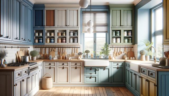
In contrast to outdated shades, several colour combinations are becoming increasingly popular for kitchen cabinets. These modern pairings not only add visual interest but also create a more welcoming and functional space. A popular trend is the two-tone cabinet design, where upper and lower cabinets feature contrasting colours. This approach adds depth and breaks up monotony, making the kitchen feel more dynamic.
Some popular cabinet colour combinations include:
- Matte black lower cabinets with natural wood uppers
- Navy blue paired with crisp white or soft grey
- Forest green cabinets with warm brass or gold hardware
These combinations offer a blend of sophistication and warmth, appealing to a wide range of interior styles from modern farmhouse to contemporary. Neutral tones like charcoal, slate, and soft taupe are also gaining traction, especially when paired with textured finishes or unique handles.
Why Neutral Palettes Are Gaining Popularity
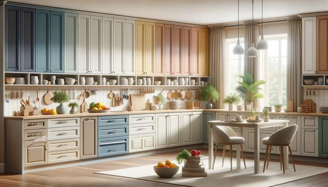
Neutral colour schemes have become a go-to choice for many homeowners due to their versatility and timeless appeal. Unlike bold or trendy colours, neutrals tend to age well and adapt easily to changes in decor. Soft greys, warm whites, and gentle browns create a calming environment that’s perfect for a room as frequently used as the kitchen.
Neutrals also serve as a great backdrop for other design elements. For instance, if you enjoy changing your kitchen accessories or wall art periodically, a neutral cabinet base makes those updates easier and more effective. Additionally, neutral tones complement a wide range of countertop materials, including marble, quartz, and butcher block.
Some of the most popular neutral colours currently used for kitchen cabinets include:
- Soft dove grey
- Warm greige (grey-beige blend)
- Off-white with yellow or beige undertones
These tones provide a clean yet character-rich canvas for various kitchen layouts and lighting conditions.
Bold Accents and Unexpected Pairings
While neutrals dominate, bold accents are making their way into modern kitchens in thoughtful ways. Homeowners are increasingly introducing rich colours like deep plum, navy, or even matte black as accent cabinets or feature walls. These darker tones add drama and contrast without overwhelming the space when used sparingly.
Unexpected pairings are also gaining momentum. For example, pairing muted sage green with matte black hardware or combining dark blue cabinets with warm wood countertops offers a fresh take on traditional styles. These unique combinations help personalize the kitchen while still maintaining a cohesive look.
Here are a few bold accent ideas to consider:
- Painted kitchen islands in a contrasting colour
- Coloured glass cabinet inserts
- Mixing painted and natural wood cabinets
Strategic use of bold colours can highlight architectural features or focal points, contributing to an overall balanced and attractive design.
Tips for Choosing the Right Cabinet Colours
Choosing the right cabinet colours involves more than following trends. It’s important to consider your kitchen’s size, lighting, and overall style. For smaller kitchens, lighter shades help open up the space, while larger kitchens can handle darker hues without feeling cramped. Natural and artificial lighting also plays a big role in how colours appear throughout the day.
It’s also helpful to think about the long-term appeal of your choices. Trendy colours may look appealing now but might not age well. Instead, aim for timeless combinations with subtle modern twists. Sampling colours in your actual kitchen space before making a final decision can help you see how they interact with light and surrounding materials.
Useful tips include:
- Test paint swatches on cabinet doors before committing
- Coordinate cabinet colours with countertops and backsplashes
- Consider the resale value of your colour choices
Working with a design consultant or interior decorator can also provide valuable insight and help you avoid costly mistakes.
Conclusion: Refreshing Your Kitchen with Confidence
Updating your kitchen cabinets with thoughtful colour choices can transform your space into a more modern and functional area. While some colours are best left in the past, there are plenty of stylish and inviting combinations to choose from today. Whether you prefer subdued neutrals or bold accent tones, the key is to find a palette that suits your lifestyle and enhances your home’s aesthetic. With careful planning and a clear vision, your kitchen remodel can deliver both style and long-lasting satisfaction.