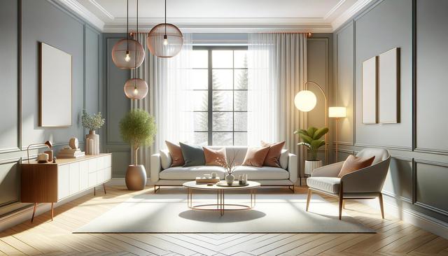
Warm Neutrals Make a Strong Return
In 2025, warm neutral tones are gaining momentum in living room design. These shades offer a cozy, welcoming atmosphere and pair well with various styles, from modern to rustic. Think soft beiges, creamy tans, and muted taupes—colours that create a serene backdrop without overpowering the space. Many homeowners are leaning into these earthy hues to create a calming vibe that feels timeless.
One reason for their popularity is their versatility. These colours blend seamlessly with different textures and materials, including wood, leather, and natural fibers. You can easily layer patterns and accent pieces without clashing tones. Warm neutrals also provide a perfect canvas for seasonal decor changes or the introduction of statement furniture pieces.
Popular warm neutrals in 2025 include:
- Soft almond
- Muted sand
- Earthy beige
- Light caramel tones
These tones are especially effective in smaller living rooms where a light colour palette can make the space appear larger and more open. Whether used on walls, furnishings, or textiles, warm neutrals are proving to be a reliable choice for long-term style and comfort.
Nature-Inspired Greens
Bringing the outdoors in continues to shape interior design trends, and in 2025, nature-inspired greens are flourishing in living room spaces. This includes sage, olive, moss, and eucalyptus tones—colours that evoke a sense of balance and tranquility. These greens help connect indoor spaces to nature, making them ideal for urban dwellers seeking a touch of the natural world.
These hues work well with organic materials like stone, wood, and woven textures. They also complement indoor plants, which remain a staple in modern living room decor. This natural palette promotes wellness and grounding, aligning with a growing interest in mindful living environments.
When using greens in the living room, consider these approaches:
- Accent walls in sage or olive
- Sofas or chairs in moss green upholstery
- Throw pillows or curtains in eucalyptus tones
Overall, green shades bring depth and sophistication to a space while maintaining a fresh and timeless look. Their current popularity shows no signs of fading as more people embrace biophilic design principles.
Deep and Muted Blues
Deep and muted blue tones are another popular choice for living rooms in 2025. These include shades like stormy navy, slate blue, and dusty teal. These colours offer a sense of calm and stability, making them perfect for areas where people gather and relax. Unlike lighter blues, these richer tones add a depth and elegance that can transform a space.
Blues of this nature work particularly well in rooms with ample natural light, as the light enhances their richness without making the room feel dark. They also pair beautifully with metallic accents like brass or matte black fixtures, adding a modern edge to traditional colour palettes.
Ways to incorporate deep blues:
- Wall paint for a bold statement
- Area rugs or cushions in complementary hues
- Artwork featuring navy or slate elements
These tones are versatile enough to blend with neutral furniture but also strong enough to stand on their own. Their rising popularity reflects a shift toward more grounded, introspective home environments.
Soft Terracotta and Clay Tones
Earthy, sunbaked colours like soft terracotta and clay are making a noticeable impact in living room decor in 2025. These warm, rich tones bring a sense of warmth and connection to the natural environment. Terracotta, in particular, evokes feelings of Mediterranean charm and rustic elegance, while clay tones offer a more subdued, grounded presence.
These colours work well in both traditional and contemporary settings. They pair nicely with natural textures such as linen, jute, and wood, and add a handcrafted, artisanal feel to any space. When used strategically, they can create focal points without overwhelming the room.
Common uses for terracotta and clay tones include:
- Accent walls or built-in shelves
- Pottery and decorative objects
- Textiles like throws and cushions
These shades also complement greenery and neutral tones, making them easy to integrate into existing decor. Their continued rise in popularity underscores a broader trend toward organic and tactile living spaces.
Charcoal and Soft Black Accents
While light and earthy tones dominate, charcoal grey and soft black are rising as statement colours in living room design for 2025. These darker hues are being used to add contrast and definition to rooms filled with lighter neutral or nature-inspired tones. Whether applied on feature walls, window frames, or furniture pieces, these colours bring a modern, refined edge to any space.
Charcoal and soft black work particularly well in minimalist or industrial-inspired interiors but are also being creatively blended into warmer, more traditional spaces. They act as grounding elements, allowing other colours and textures to shine while adding visual interest.
Effective uses of dark accents include:
- Low-profile shelving or storage units
- Dark trim or baseboards
- Framed art or mirrors
These deeper shades are best used in moderation to avoid overpowering the room. When balanced correctly, they can enhance the architectural features and add a layer of sophistication to the overall design.
Conclusion: Creating a Balanced and Stylish Living Room
Choosing the right colour palette is a key step in designing a living room that feels both modern and personal. The popular colours of 2025—ranging from warm neutrals and natural greens to deep blues and soft blacks—offer a wide range of options for different tastes and styles. These shades reflect a broader movement toward comfort, mindfulness, and nature-inspired living.
By incorporating these trending tones thoughtfully, homeowners can achieve a space that feels fresh yet enduring. Whether you’re planning a full renovation or small updates, using colour strategically can elevate your living room and make it a place you truly enjoy spending time in.


